My Benjamin Moore Colour Trend Art Challenge
 |
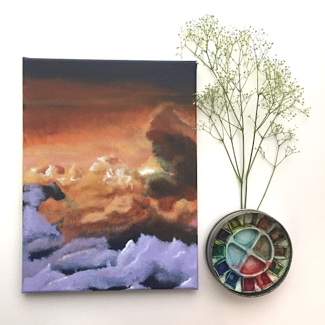
| Testing the Shadow 2117-30 colour for my project |
I couples days ago I was perusing through the Internet looking for some inspiration and learned that the Benjamin Moore's Colour of the year for 2017 is a really rich and deep purple called Shadow 2117-30. I've been into purples lately so, naturally, I was drawn to that particular colour. In colourpsychology.com, purple is said to have a calming effect over the mind and nerves. It can be uplifting, trigger creativity and increase intuition. To me purple also represents balance as it's the combination of the high energy of the colour red and the cool calming energy of the colour blue. Interestingly, when looking into what it means to like the colour purple, a lot of the description fits my personality. At least part of it.
Inspired by that colour, I decided to create a piece of artwork featuring Shadow. But then I also looked at the entire colour palette for 2017 and saw more interesting colours with eye catching names such as Gentleman's Gray, Sea Star and Stormy Monday. So I decided to upgrade my idea and turn it into a year long art challenge for the upcoming year: Perfect time for a new art challenge! So my art challenge for 2017 is to create art pieces featuring each of the 23 colours of the 2017 trend colour palette. It should be an interesting experience. I already went ahead a couple days ago and bought my first four colour samples : Shadow, Gentleman's Grey, Amulet and Cloud Cover (shown below).
 |
| (left to right) Shadow 2117-30, Gentleman's Grey 2062-20, Amulet AF-365, Cloud Cover OC-25 |
I'm not entirely sure how this is going to go. At first I was just going to use them in a painting but I've decided that these painting will only use the colours from that palette and that they will be used in my cloud painting project. I've never used them to paint on canvas before so it will be interesting to see what comes out of that idea.
Wish me luck!

Comments
Post a Comment